Studiosus Travel
Studiosus is Europe’s number one cultural tour operator. High-quality tours and well thought-out programs ensure Studiosus has continued to be the market leader for many years. Founded in 1954, Studiosus develops and organizes over 1.000 trips to over 100 countries every year.
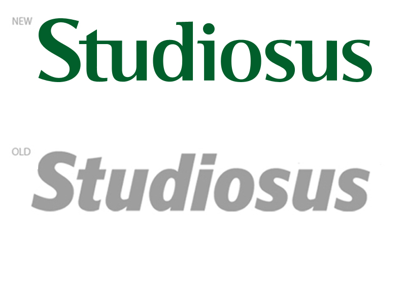
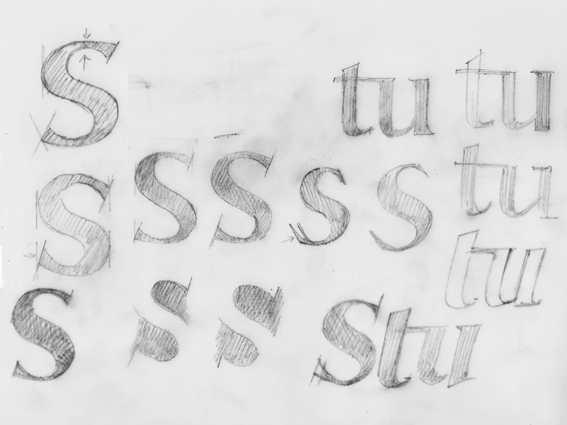
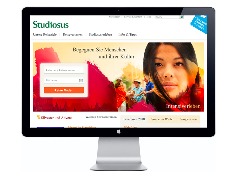
The ambitious task was to update and redesign the logotype of this long-established company.
The brief was to create a modern, still classic, authoritative logotype that was less bold and bulky, but more elegant and organic. Still, it had to be strong and confident enough to claim its premium position in the tourism market.
To achieve these goals I removed the italic alignment and merged a modern non-serif with a classic serif font. Then I created a new semi-serif typeface that represents the values and characteristics of this company. The extensive project took many months and multiple revision rounds. The new typeface has been in use for over ten years now.