Kaimug Thai Restaurants
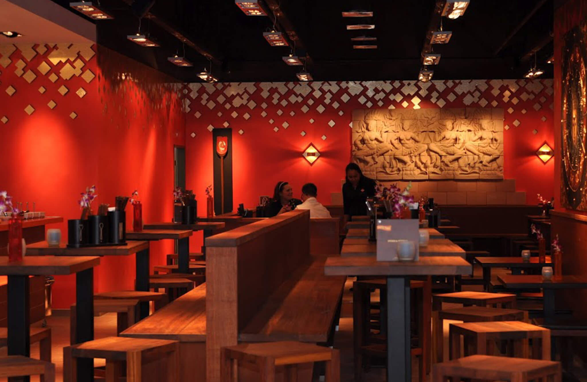
Kaimug stands for authentic modern Thai food. In the last 10 years Kaimug Thai Restaurants became a great success story with over 20 restaurants in Germany.
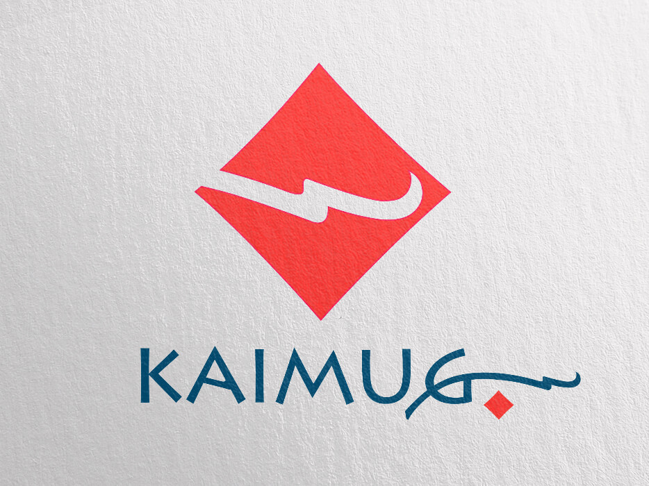
The initial brief was to create a strong, modern logo for ‘Kaimug Take Away’ a small company with ambitions to grow. A visual identity with the potential to support a major brand.
I created a logotype with a clean but distinct typeface in combination with an elegant Asian floral-swirl. However, the core element of the logo is the diamond covered by the swirl. ‘Kaimug’ means pearl in Thai and the diamond stands for the pearl. The diamond pearl became and still is the core element of the whole visual identity.
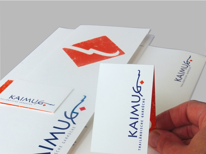
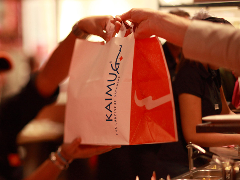
I also created the branding guidlines including colour scheme and font usage, the packaging design and initial web design for Kaimug Thai Restaurants.
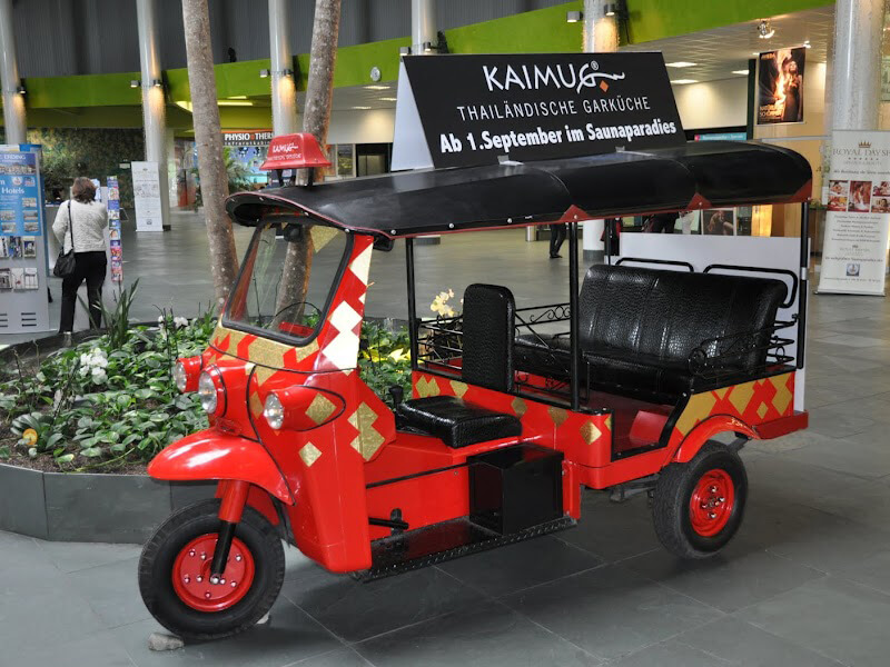
KAIMUG BOX is a sub-brand of Kaimug, the franchise concept for small food stalls with Thai food freshly prepared to take home.
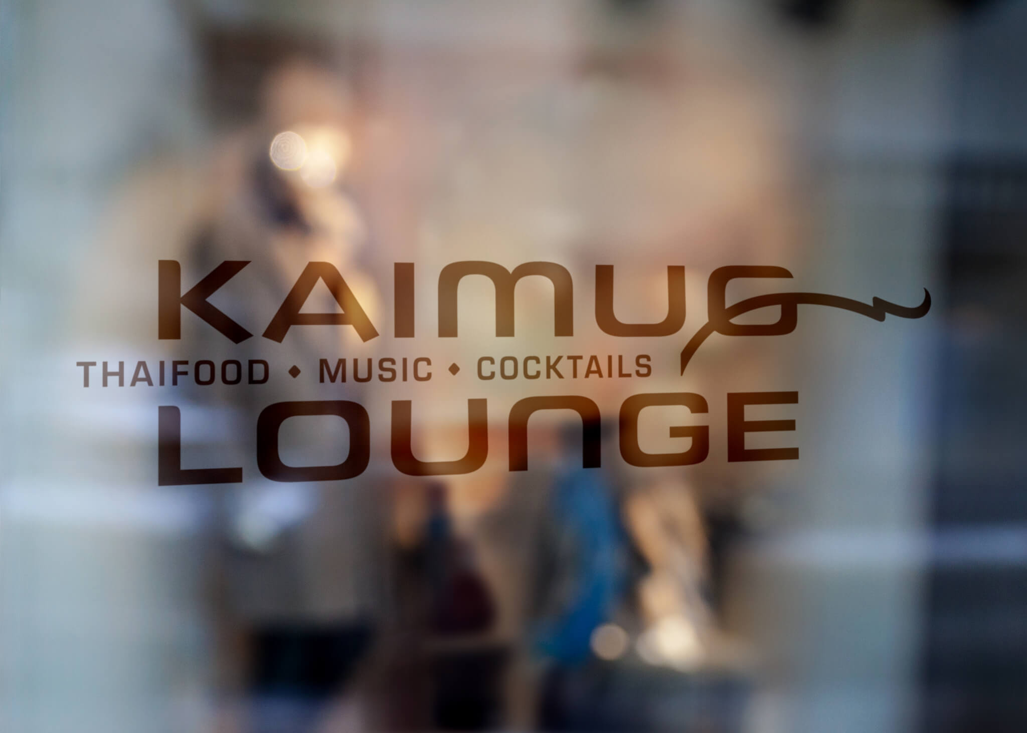
The latest enterprise is KAIMUG LOUNGE a sub-brand with focus on food, music and cocktails.
Disciplines
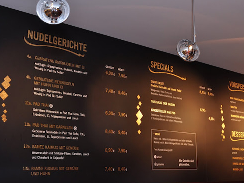
Concept, brand identity, logo design, colour scheme, packaging design, promotional materials, shop design
Client
Kaimug Ltd., Thai Restaurants, DE