Protevan, Van Conversions
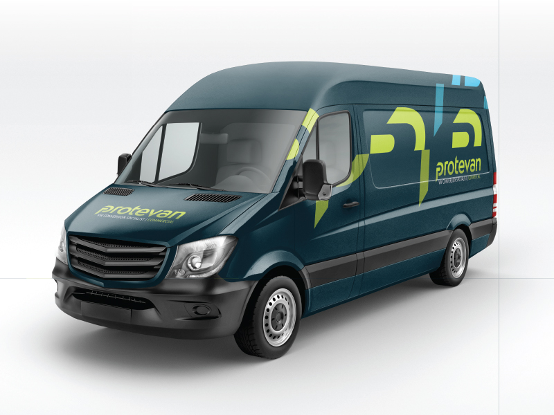
Protevan develops and designs interior van conversions both for commercial and leisure purposes. Core principles of the product are quality, precision, reliability and versatility. It was these values that needed to shine through with the logo design and whole branding.
The unique shape of the letter ‘p’ refers to the plug-in philosophy of the product and gives the typeface its distinctive shape.
Dynamic identity: Another core principle of the product is its modular character. The logotype works as a toolbox for the visual language of the brand. Like a jigsaw it can be put together in endless different ways.
Disciplines
Branding, art direction, logo design
Client
Gridworth Limited, Warwick, UK